HEDONSKATE
Project Details
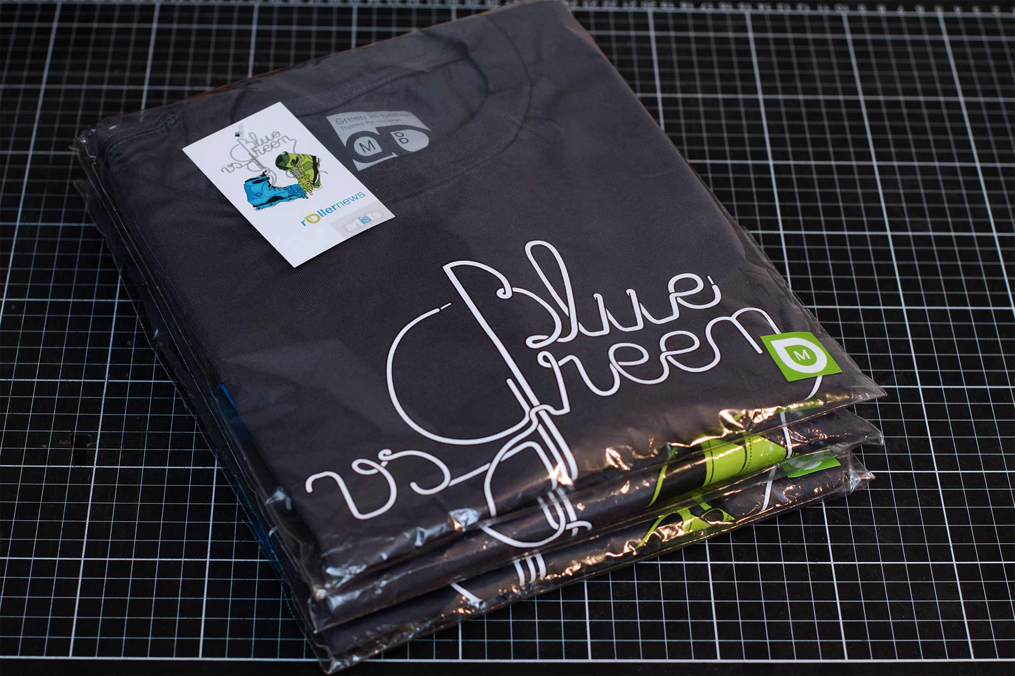
Client: Hedonskate
Hedonskate is one of the largest electronic retail businesses in Europe dedicated to aggressive inline skating. The polish shop supports and promotes the sport selling hardware and organizing events all over the continent.
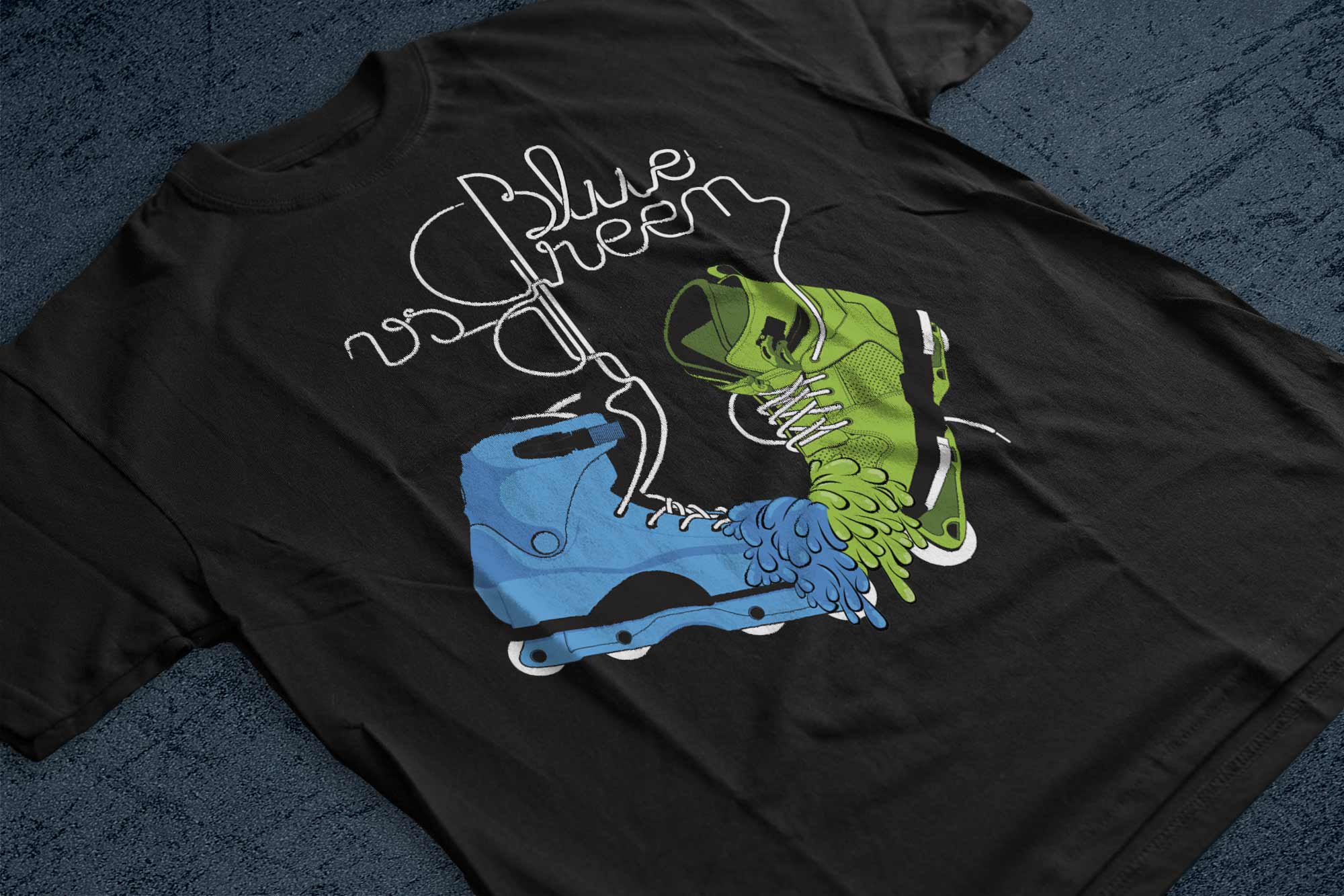
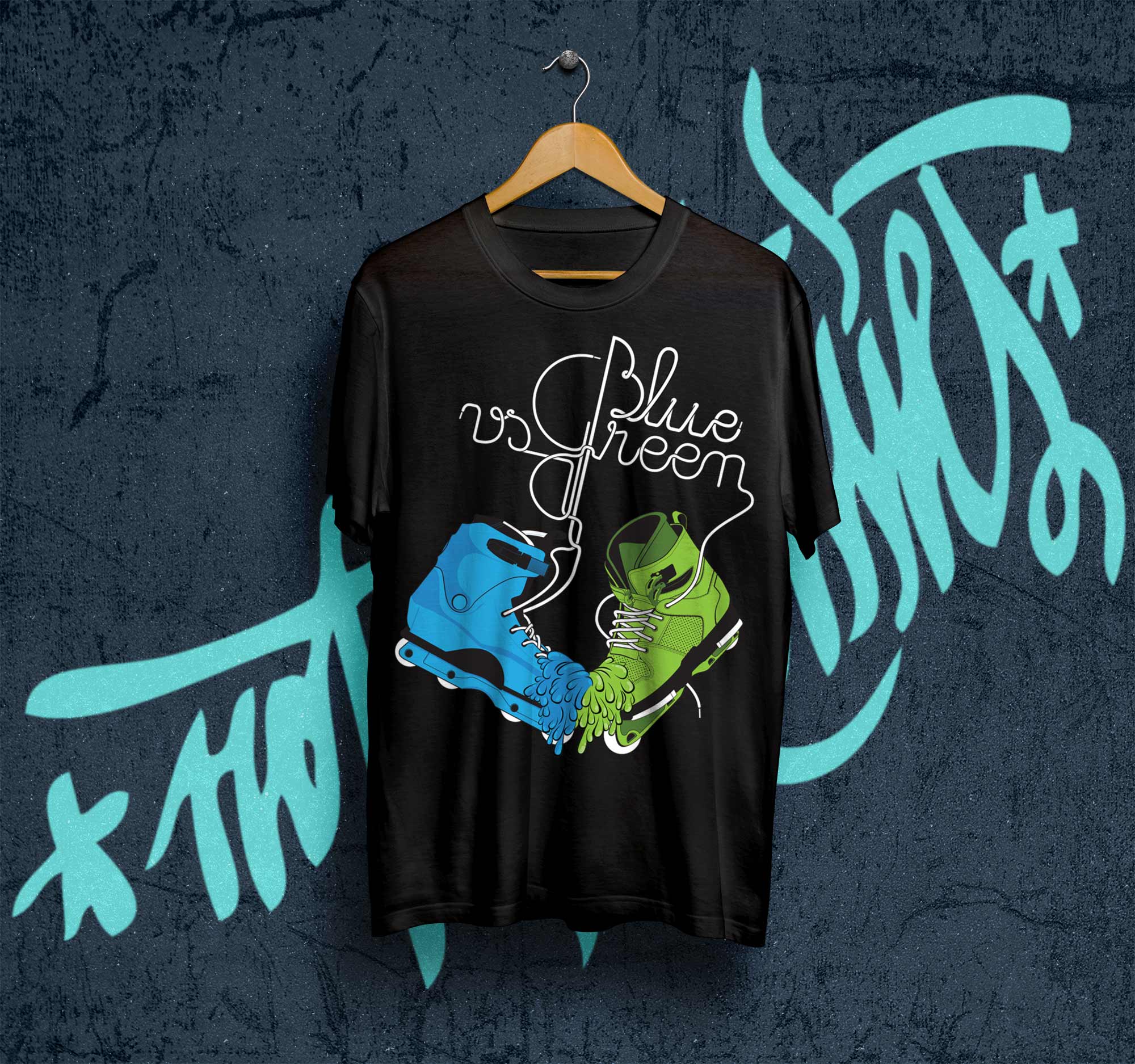
Mottos like ¨not for sissies¨ and ¨green is better¨ had been a part of the brands image before they asked to associate with new art representing their idea of ¨green against blue¨.
The design represents the classic and the modern virtues of the sport coming together.
The typographic treatment introduces the concept echoed in the color scheme. Two boot designs melt together as a symbol of old and new, the root and the future of the sport. The typography softens the aggressive message, conveying a sense of playfulness that is also present in the culture of this sport.